Design for Thumbs,
Not Cursors
mobux is the definitive platform for building mobile eCommerce experiences that convert. Optimize every tap, swipe, and scroll for real mobile shoppers.

comes from mobile
a poor mobile site
with optimized mobile UX
volume in 2026
Everything your mobile store needs
From layout patterns to checkout flows — we cover every touchpoint in the mobile shopping journey.
Mobile Layouts
Responsive grid systems, card layouts, and scroll patterns built specifically for small screens.
Explore layouts →Thumb-Friendly Design
Design for the natural reach zones of the human thumb. Make every tap effortless.
Learn more →Speed Optimization
Sub-second load times through image optimization, lazy loading, and critical path CSS.
Get fast →Checkout UX
Reduce cart abandonment with streamlined, mobile-native checkout experiences.
Optimize checkout →Navigation Systems
Bottom tabs, gesture navigation, and smart search that guide users to products fast.
Design nav →Case Examples
Real-world mobile UX transformations with measurable conversion improvements.
See results →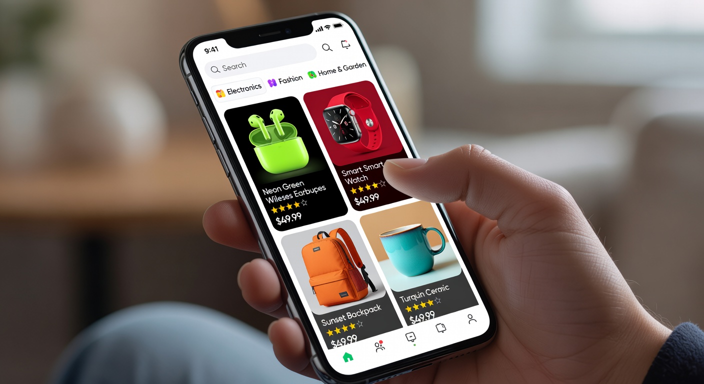
Mobile shoppers behave differently
Mobile users scroll faster, tap imprecisely, shop in short bursts, and abandon at the slightest friction. We design for how people actually use their phones.
- Patterns based on real mobile heatmap data
- Touch target sizes optimized for all thumb types
- Checkout flows that survive one-handed use
- Performance budgets for 4G and 5G networks
- Continuous testing on 50+ device profiles
How mobux works
A four-step framework to transform your mobile store into a conversion engine.
Audit
Deep analysis of your current mobile UX, performance metrics, and friction points.
Design
Mobile-first wireframes and prototypes based on thumb-zone data and user behavior.
Implement
Engineering-ready specifications delivered as code components and design tokens.
Measure
Real-time dashboards tracking conversion rate, bounce rate, and session depth.