Turn Abandoned Carts into Completed Orders
70% of mobile shoppers abandon checkout. We design checkout flows that remove every ounce of friction between intent and purchase completion.
Fix My Checkout →The 5-step mobile checkout we design
Each step is stripped to its minimum required fields. No account creation walls, no surprise fees, no re-entering data.
Cart Review
Confirm items, apply discounts
Contact
Email & phone only
Delivery
Address & shipping choice
Payment
Native pay or card
Confirm
Order summary & tracking
Why mobile shoppers abandon checkout
Understanding abandonment is the first step to fixing it. These are the three leading causes we address in every checkout redesign.
Too Many Form Fields
The average mobile checkout form has 23 fields. The optimal number is 7. We eliminate every non-essential input.
Forced Account Creation
Guest checkout is not optional — it's essential. We place account creation after purchase confirmation, not before.
Poor Payment Options
Apple Pay, Google Pay, and BNPL eliminate the need to type card numbers. One tap to complete.

A checkout that fits one hand
Our checkout interface is engineered for one-handed use. The primary action button is always in the natural thumb zone. Form fields auto-advance. Errors appear inline without page jumps.
- ✓Auto-advance fields — Cursor moves automatically after postcode, card number, expiry
- ✓Address autocomplete — Google Places API fills shipping in one tap
- ✓Sticky order total — Always visible summary prevents second-guessing
- ✓Inline validation — Real-time error feedback without form submission
Native payment first, card second
Mobile payment completion rates are 2× higher with native payment methods. We integrate all major mobile wallets and present them prominently above traditional card entry.
Apple Pay
Face ID one-tap checkout
+48% conversionGoogle Pay
Fingerprint authentication
+41% conversionPayPal
Trusted globally
PopularBNPL
Klarna, Afterpay & more
+23% AOV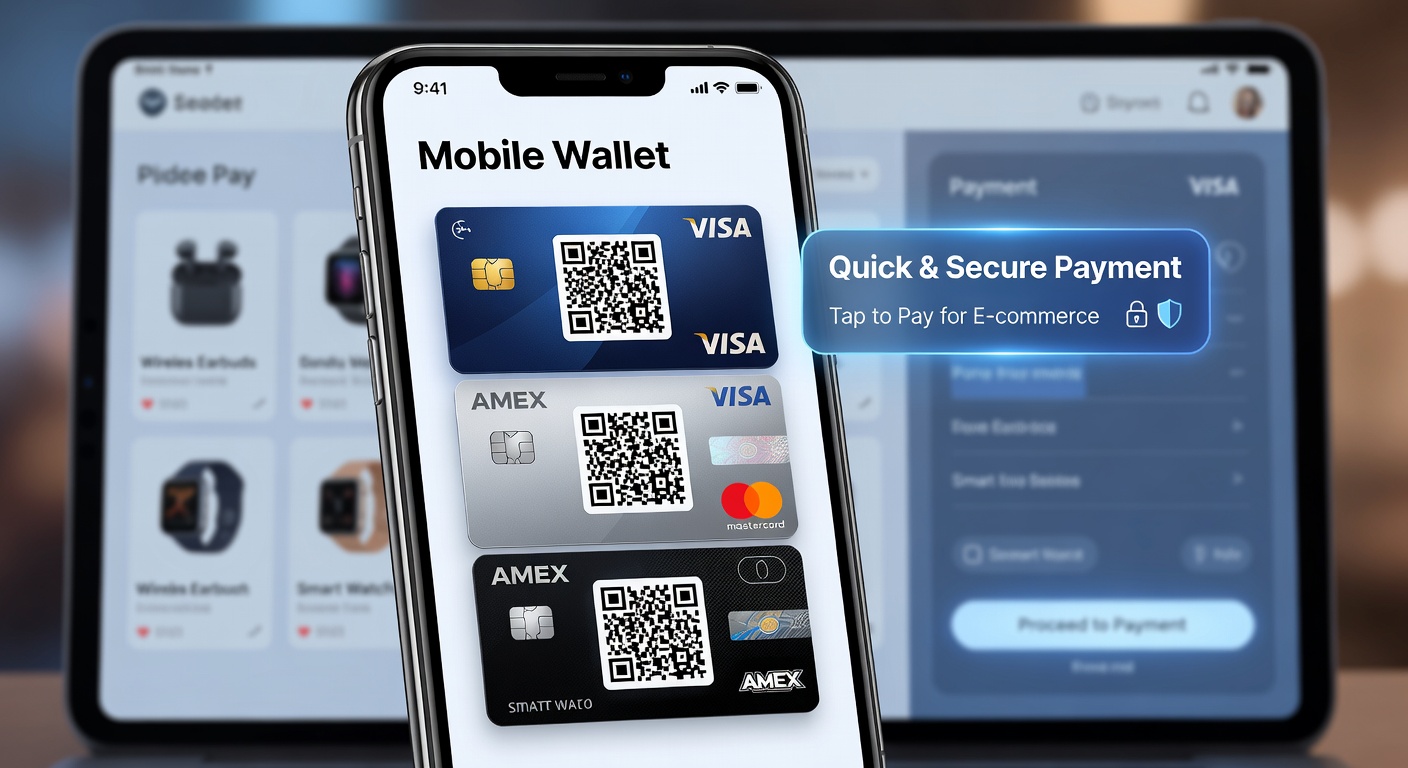
The form field rules that double completions
Forms are the single biggest friction point in mobile checkout. These principles reduce form abandonment by up to 60%.
Use appropriate inputmode
inputmode="numeric" shows number keyboard for card fields. inputmode="tel" for phone. Avoid type="number" for card numbers — it breaks on some devices.
Enable browser autofill
Correct autocomplete attributes (autocomplete="cc-number", "postal-code") let browsers and password managers fill forms in one tap.
Label placement matters
Floating labels that move above the field on focus prevent the label being hidden by the virtual keyboard on small screens.
Large touch areas on inputs
Input height minimum 48px with 16px internal padding. Font size 16px to prevent iOS auto-zoom (which breaks layout).
Validate on blur, not submit
Show errors after the user leaves a field, not when they submit. Submit-time errors cause users to scroll and hunt — fatal on mobile.
Single column layout
Never put two form fields side by side on mobile. Side-by-side fields reduce touch accuracy and increase errors by 40%.