Layout Systems Built for Small Screens
Every pixel matters on mobile. Discover the layout patterns, grid systems, and scroll mechanisms that keep users engaged and clicking through.
Get a Layout Audit →Three layouts that rule mobile commerce
Research shows layout choice alone affects scroll depth by up to 38%. Choose the right pattern for the right context.
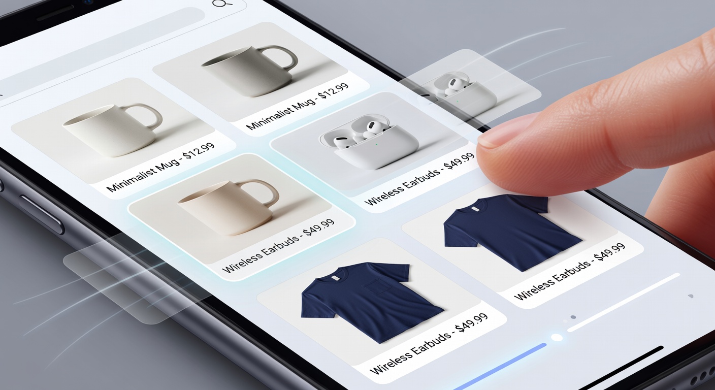
2-Column Grid
Perfect for product listing pages. Maximizes visual density while keeping product images large enough to trigger purchase desire.
Best for PLPsHorizontal List
Full-width rows with thumbnail left, product info right. Ideal for comparison-heavy categories where specs matter more.
Best for ComparisonSingle Column
Full-width cards for featured products, editorial content, or limited-edition drops. Demands attention and drives focus.
Best for Featured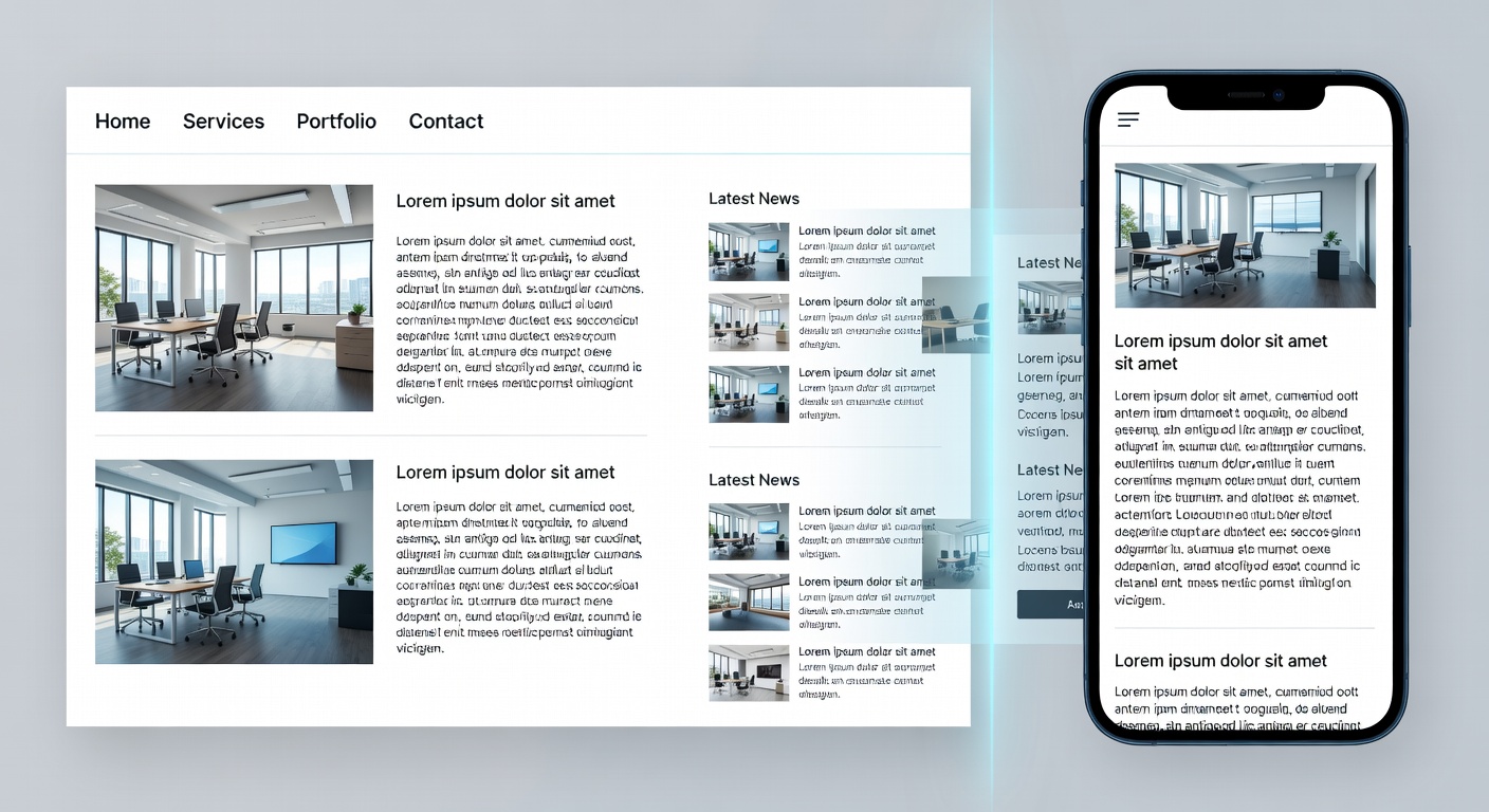
Design once, adapt everywhere
A true mobile-first layout begins at 320px and gracefully expands. We never shrink a desktop layout — we grow a mobile one.
-
Fluid Typography Scale
Text scales with clamp() — readable at 320px, elegant at 1440px.
-
CSS Grid Intrinsic Design
auto-fill and minmax() create naturally responsive grids without breakpoints.
-
Container Queries
Components respond to their container width, not viewport — truly composable.
The mobux breakpoint system
Opinionated breakpoints tuned for eCommerce. Each breakpoint unlocks a layout upgrade.
| Breakpoint | Range | Columns | Layout Mode | Key Changes |
|---|---|---|---|---|
| xs | 320–479px | 1 | Single Column | Full-width hero, stacked nav, bottom CTA |
| sm | 480–767px | 2 | Compact Grid | 2-col product grid, bottom navigation bar |
| md | 768–1023px | 3 | Tablet Hybrid | Side filters, 3-col grid, persistent header |
| lg | 1024–1279px | 4 | Desktop | Mega menu, 4-col grid, sidebar cart |
| xl | 1280px+ | 5+ | Wide Desktop | Max-width container, editorial layouts |
Scroll is the mobile UX engine
Unlike desktop where users click to navigate, mobile users scroll to discover. Design scroll experiences with infinite delight.
Infinite Scroll
Load content in 20-item batches triggered at 80% scroll depth. Never paginate a mobile product list.
Horizontal Carousel
Swipeable product rows with momentum scrolling for category browsing. 40% more products discovered.
Sticky Filter Strips
Keep filters visible as a horizontal chip strip pinned below the header during scroll.
Scroll-Snap Galleries
CSS scroll-snap-type for product image galleries creates native-app feel with pure CSS.