The Human Thumb Is Your Design Constraint
The average thumb has a contact area of 8–10mm. Every button, link, and interactive element must be designed around this biological reality.
Audit My Touch Targets →Where thumbs comfortably reach
Steven Hoober's research on 1,333 mobile users shows 49% use their phone one-handed. Design for where the thumb naturally lands.
Minimum target sizes that actually work
Tap each card to see the recommendation. Apple HIG suggests 44pt minimum. Google Material requires 48dp. mobux recommends 56dp for primary CTAs.
24×24 dp
Below any standard. Users miss 60% of taps. Never use.
40×40 dp
Barely acceptable for inline text links in paragraphs.
48×48 dp
Material Design standard. Good for navigation and form elements.
56×56 dp
Optimal for Add to Cart, Buy Now, and payment buttons.
Native-feel interactions in the browser
Modern PWA technology lets mobile web stores deliver the same tactile satisfaction as native apps — no download required.
- ✓Visual press states — Immediate visual feedback that mimics tactile response
- ✓Spring animations — Momentum-based transitions that feel physical and satisfying
- ✓Gesture recognition — Swipe-to-dismiss, pull-to-refresh, pinch-to-zoom
- ✓Context-aware keyboards — Numeric for prices, email for sign-up, phone for checkout
The six gestures that matter in eCommerce
Every gesture must feel earned, consistent, and discoverable. These are the patterns that drive engagement and conversion on mobile.
Tap
The primary action. Must respond within 100ms with a visual state change. Delay over 200ms feels broken to users.
Use for: All primary actionsDouble Tap
Wishlist save, zoom into product image. Add visual confirmation (heart animation) to make it feel rewarding.
Use for: Wishlist, image zoomHorizontal Swipe
Product image carousels, category browsing, delete-from-cart. Needs momentum and rubber-band at edges.
Use for: Carousels, galleryPull to Refresh
Refresh order status, live inventory counts. Give clear visual feedback during the pull with animated indicators.
Use for: Order trackingPinch to Zoom
Essential for product detail images. Enable native pinch-zoom and never override it with custom JavaScript.
Use for: Product imagesLong Press
Quick-add to cart from grid view, context menu. Use with care — discovery requires a subtle visual hint.
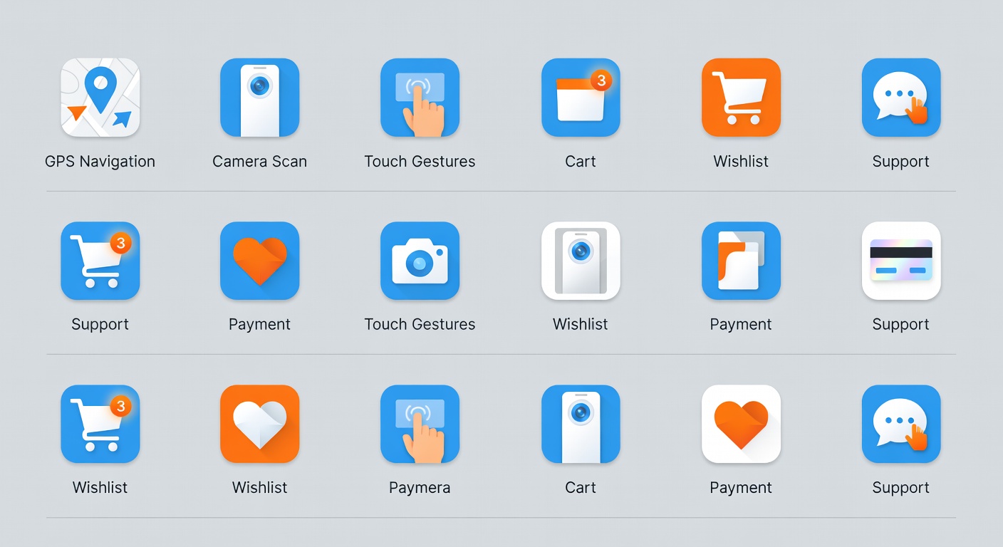
Use for: Quick actionsIcons that communicate in 200ms
Mobile screens have no room for misunderstanding. Every icon must convey its meaning instantly at small sizes without requiring a text label.
We use a purposefully limited icon vocabulary — 28 icons across the entire eCommerce journey. Consistency reduces cognitive load and speeds navigation by up to 22%.
All icons are tested at 24dp minimum, with 2px stroke width, in both light and dark modes across 12 device types.
See the Icon System →